Elements that Guarantee the Success of an Author’s Website
Getting an author’s website designed may sound fun and games until you finally start looking for website designers to get the job done. Again, you will be able to find hundreds of website designers as soon as you enter the keywords ‘hire a website designer’ on Google or any other engine. But what makes it difficult is choosing the best one for yourself.
To ensure the success of your website, begin by conducting in-depth research for the designers you have shortlisted. Only trust those who have been in the business for a while and have qualified to become a web designer. Oh, and don’t forget to ask about samples or their portfolio, if setting up your web hosting is also in their service package & finally can they also setup your business email.
The next big thing on your list should be checking and confirming that all the important features are incorporated into the designing phase. And if you aren’t sure what an author’s website must have, here are five elements that you simply can’t miss out on.
Sure, you can have advanced features and incorporate as many as you like but those that are discussed below are easy to arrange and ‘inescapable’ for the success of a writer’s website.
Read on!
1. Regular Updates and Overhauls
When you get your website designed, make sure to have enlisted it for regular overhauls. Many outsourcers have discount packages for those who want continued services; so it gets even better with this.
Apart from the overhauls, ensure that your website is updated regularly. If you publish blogs, keep publishing new ones frequently so that the visitors don’t get disappointed on any visit. Likewise, if you share updates about your work, teasers, or pictures, keep doing them often. Don’t allow your website to go outdated with blogs and posts from the preceding year.
2. Include CTA (Calls to Action)
CTA statements are extremely important. They entice website visitors to subscribe to what you want them to subscribe to or make purchases. If you fail to include CTA and appropriate buttons along with them, you will cause your website visitors to wander looking for ways they can subscribe or make a purchase. And if it is time-consuming or difficult, they will end up fleeing and looking for alternatives unless you are offering a huge discount, which is rare.
Here are some sample CTA statements:
- Subscribe to our mailing list today to stay updated about discounts, offers, and new publications.
- Buy the book now!
- Go book-shopping today!
- Visit our social media profile.
3. Add Contact Info
This is something no business website in the world should miss. Add not one but several methods your website visitor can reach out to you. These include mailing address, office address (if any), social media profile link, website live chat, and phone.
4. Include Author’s Intro
Those who know you know you well enough to skip the intro part and make a purchase. But there always will be some who are new to your website and you must include an introduction to cater to them. The introduction should include a blend of ‘few’ details of your personal and professional life, some of your major achievements, best-selling books, etc.
5. Add Images
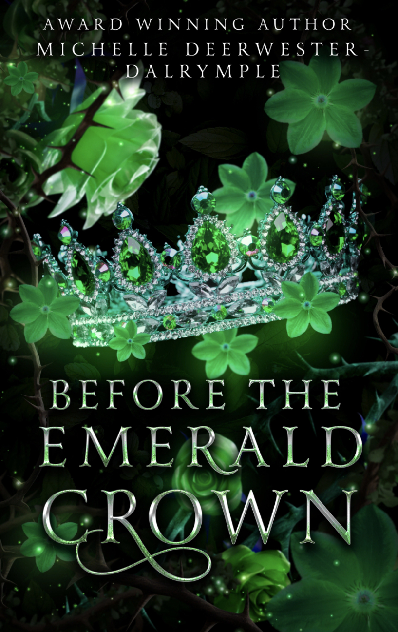
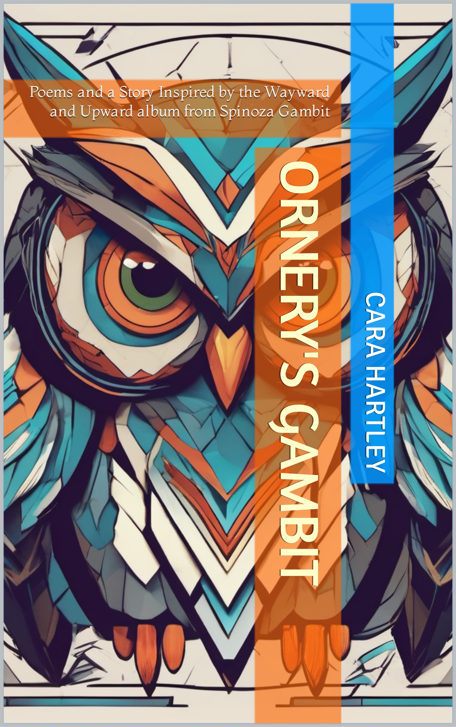
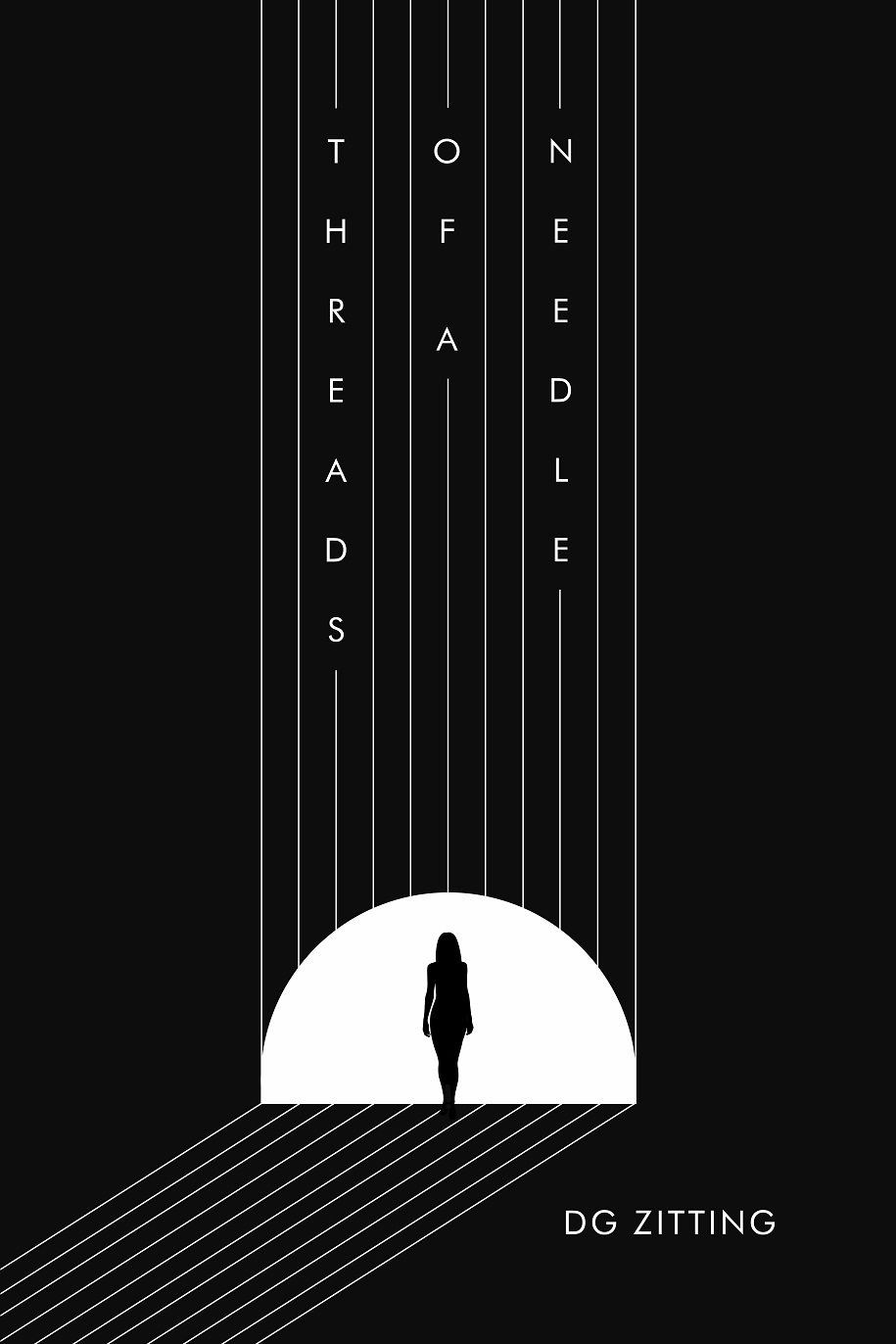
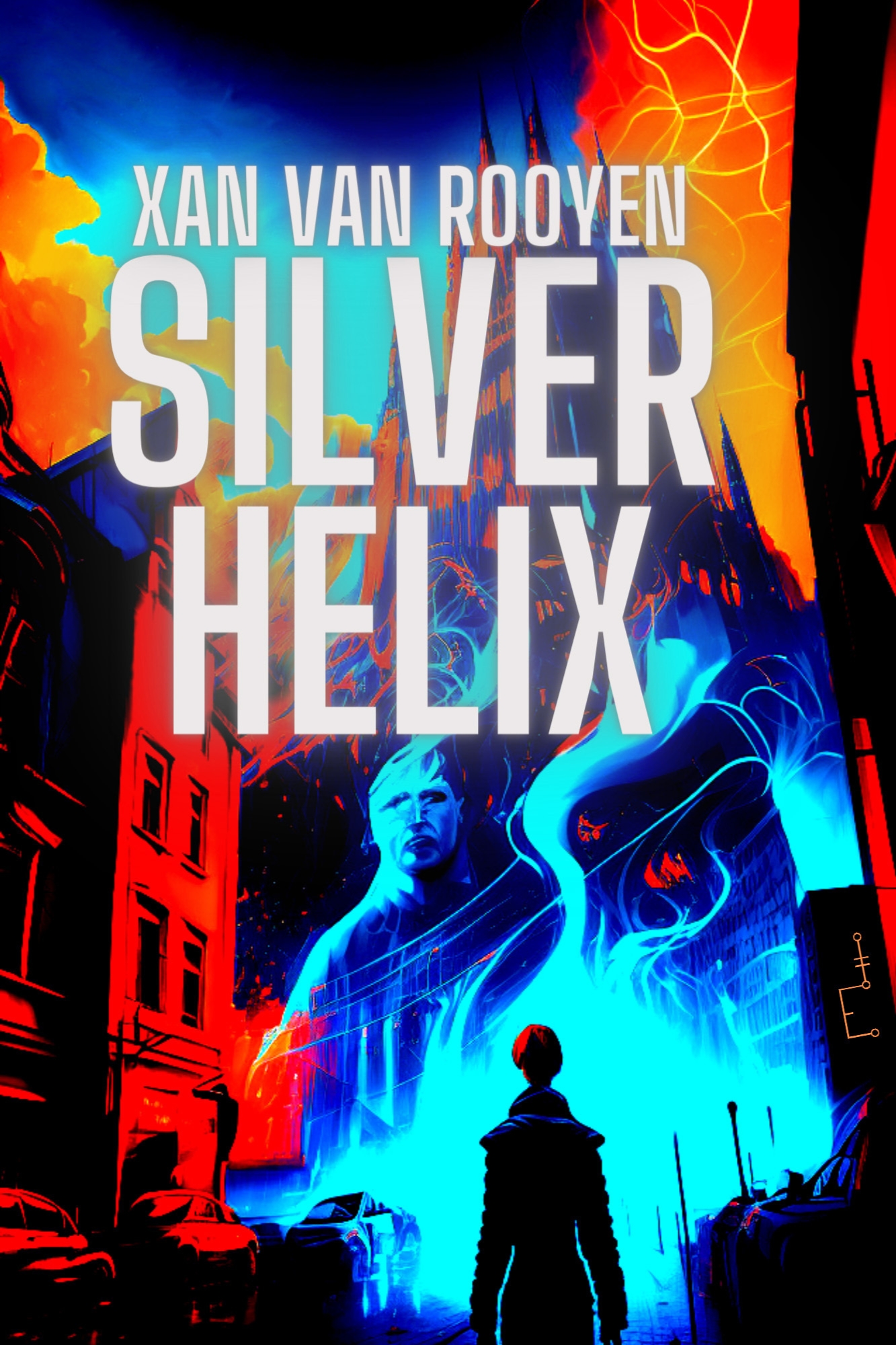
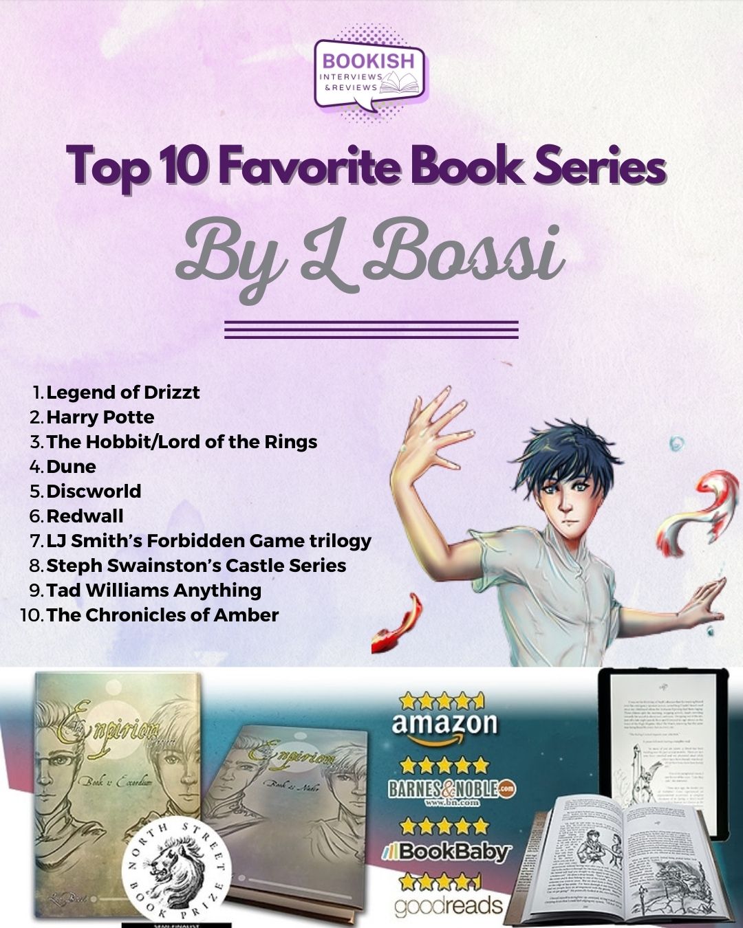
An image can convey in seconds what you can’t convey in 1000 words. No website can perform well without having interesting images and videos and the same goes for a writer’s website. Include one of your images and several others that display your books, random quotes, any exhibitions that you might have participated in, etc.
Connect with the team at Writers and Authors now to get an all-inclusive website designed for yourself!


